Knobs Are Back: Reading Euro NCAP's 2026 Verdict on Touch, Swipes and Muscle Memory
It's half four on a December afternoon on the A34. Dark already, drizzle on the windscreen, and the car ahead has just stood on its brakes. Your left hand goes for the hazard lights and meets a slab of glass, a submenu, and a small haptic tick that could mean "yes", "no" or "not that one, try again".
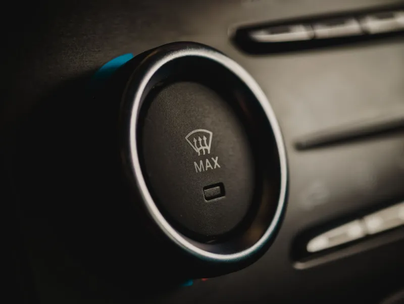
That half second of doubt at 60 mph is exactly the sort of thing Euro NCAP has spent years trying to design out of new cars. From January 2026, its safety ratings require physical controls for five core functions: indicators, hazard warning lights, the horn, windscreen wipers and the eCall/SOS button. Wire those to actual switches and a car stays eligible for the full five stars. Sink them into a touchscreen and it doesn't.
For anyone who designs interfaces for fingers — cabins, headsets, museum walls, ticket kiosks — this is worth a proper look. Not because the verdict is "buttons good, screens bad", but because the rule quietly formalises an argument the immersive world has been having with itself for the better part of a decade.
Why a crash-test body has opinions about switches
Euro NCAP isn't a regulator. It doesn't ban anything; it hands out stars, and manufacturers chase them because buyers and fleet managers read the results. That gives it a surprising amount of leverage over what ends up on a showroom floor in Britain.
The reasoning behind the 2026 change is plain enough. Taking your eyes off the road to hunt for a climate menu is a distraction task, and distraction costs reaction time. A stalk you can flick without looking is a different kind of interaction entirely — one that runs on memory rather than attention. The safety body isn't really asking for metal and plastic. It's asking for interactions that don't require a visual search.
That distinction matters, and it's the bit the "screens are killing driving" headlines tend to flatten.
What drivers get back
The obvious gain is muscle memory. Indicators, wipers and hazards are things you operate in a hurry, in bad weather, often while something else is going wrong. A physical control has a fixed position, a fixed travel and a satisfying click, and your hand learns all three without being taught. You can find it in the dark, through a glove, with your eyes on the road.
The subtler gain is confidence. A switch that clunks tells you it has worked. A touch target that buzzes tells you it has registered a touch — which is not the same as telling you the fog lights are now on. Anyone who has spent time in VR knows that gap intimately: the difference between "input accepted" and "state changed" is where most user frustration lives.
And there's a nice side effect for the second-hand market. Physical controls age better than glass. A 12-year-old dial still works when the screen behind it has gone dim and the software update channel has closed.
What drivers lose
Let's be fair to the touchscreen, though. Screens are cheap to reconfigure, they let a car be updated after it leaves the factory, and they make space in a cabin that has to hold a lot of airbags. A single well-designed display can replace thirty switches, and for functions you set once a month — seat heating, drive mode, radio presets — that's genuinely better than a dashboard bristling with buttons nobody understands.
The risk is that the five-function rule turns into a design alibi. Manufacturers could bolt on the legally required switches, leave everything else in a menu, and call it done. That would pass the test and miss the point. Euro NCAP has picked five functions because they're the ones you need in an emergency, not because those five are the only things worth a physical home.
The bit that concerns anyone building VR
Strip away the cars and the rule is a useful framing device for immersive design. It's essentially asking: which interactions deserve a dedicated, findable, no-look-required control, and which can reasonably live behind a menu?
VR has the same problem in a more intense form. In a headset, everything is a screen, and the temptation is to treat every input as a pointer. But a user's hands are already doing three jobs — holding a controller, keeping their balance, staying out of the way of a coffee table. Attention is the scarce resource, and eyes are usually busy.
So here's the mental checklist I've been using since the rule landed, and it maps almost one-to-one onto the cabin debate.
Is it used under time pressure? If the answer is yes, it wants a fixed location and a definite confirmation. That's the hazard-light test. In VR terms: pause, exit, safety boundaries, anything a first-time user might need to find while panicking.
Is it used often enough to build memory? A control you hit forty times a session earns a permanent spot. One you hit twice a year doesn't, and forcing it into a dedicated gesture is just clutter with extra steps.
Does the user need to know the state, or just that they pressed something? This is where haptics get overworked. A buzz is confirmation of contact. It is not feedback about outcome. If your design only ever says "we felt that", you've built a very responsive dead end.
Button, gesture, or buzz?
My rough rule of thumb, arrived at through more failed prototypes than I'd like to admit: use a button when the action must be repeatable, discreet and confirmable without sight. Use a gesture when the action is exploratory, reversible and happens in a space the user can see. Use a haptic cue when you're confirming something that already happened — a surface you've touched, a slot you've entered, a boundary you've reached.
Where designers get into trouble is using a buzz to do a button's job. A vibration can tell you that your finger has landed on the right patch of nothing. It can't tell you which of six identical patches it is.
What to take back to the workshop
The Euro NCAP change is, in the end, a fairly modest piece of regulation-by-rating. It won't reverse the screenification of the cabin, and it won't stop manufacturers from burying the seat heating three menus deep. But it does put a number on something designers have suspected for years: physical controls aren't nostalgia, they're an accessibility feature and a safety feature that happens to also feel nice.
Which is a decent thing to remember next time you're arguing in a studio about whether a menu needs a shortcut. If your user is cold, in a hurry, wearing gloves, or not looking, the answer is usually the same one the crash testers arrived at.